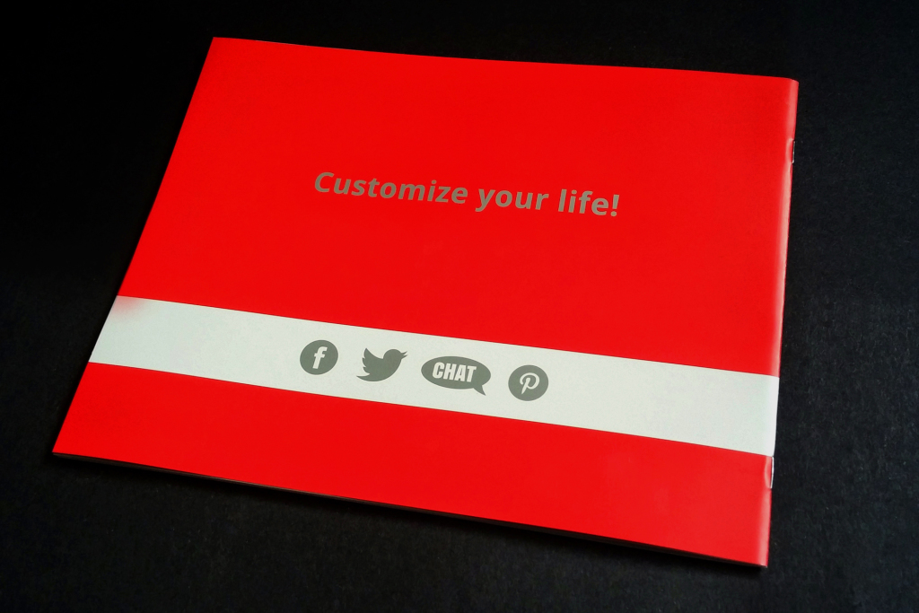
With a Soft Touch coating and a clean sleek layout, the design goal of this catalog was to instill in the customer a sense of quality and professionalism.

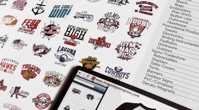
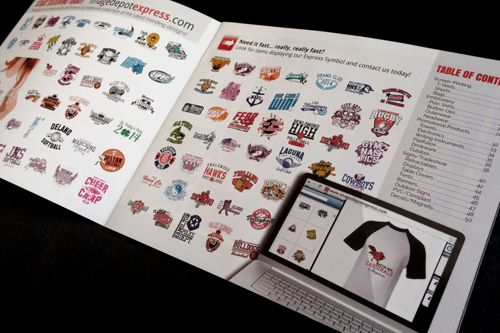
The table of contents section begins with a large assortment of stock designs in order to help get the customer’s ideas flowing. This is used as a tool to assist the customer with envisioning their design on many different products. On the far right sits the table of contents unobtrusively but easily found.
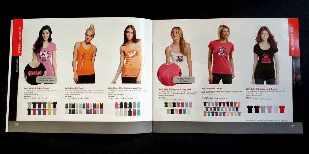
This photo shows an example of the product layout. The three products per page layout in this example was used in order to maintain consistency and ease of reading.
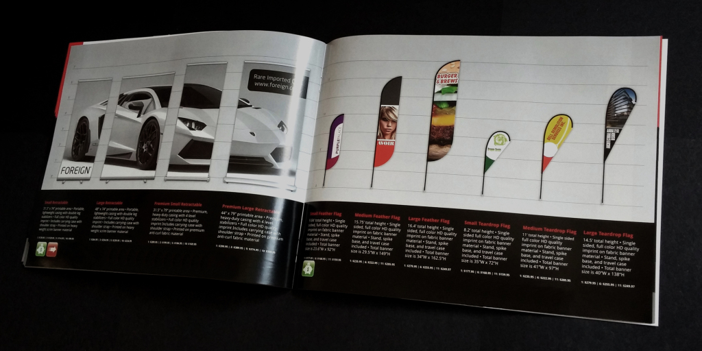
The stands for the retractable and flag banners on these two pages were custom designed to scale in illustrator to reinforce a consistent look. The design in the retractable banners serves a duel purpose. It depicts the single banner use and additionally shows the impact of using multiple retractable banners together for greater impact.
The back cover is a continuation of the front cover. It contains the slogan and social media icons all in a foil imprint.
